Every marketer and business owner wants a landing page that turns visitors into leads, subscribers, or customers — but only a few truly succeed. A high-performing landing page doesn’t just look good. It drives action. With the right landing page conversion tips and strategic UI/UX elements, you can guide visitors from first glance to completed conversion without confusion or hesitation. In this guide, you’ll learn current best practices backed by industry insights and real-world performance data to build landing pages that produce measurable results.
What Is a Landing Page and Why Does It Matter?
A landing page is a standalone web page created with a single purpose — often to collect leads, sell a product, download an asset, or register for an event. Unlike homepages, which provide broad navigation, landing pages are focused on one conversion goal. Removing distractions and guiding the user toward one clear outcome is the foundation of great conversion optimization.
Effective landing pages are essential because they improve ROI, reduce marketing waste, and directly impact your revenue and lead generation — all by converting more visitors without increasing traffic.
Landing Page Conversion Tips You Must Follow
1. Craft a Clear and Compelling Headline
First impressions count. Your headline should immediately communicate value and resonate with visitor intent. Effective headlines match the promise in your ad or search result and answer “What’s in it for me?” within the first few seconds.
Best practices:
- Keep headlines short and benefit-focused.
- Use strong, clear language that communicates the main offer.
- Position the headline above the fold — the area users see without scrolling.
2. Use Strategic UI/UX Elements for Flow and Clarity
UI/UX elements are critical for creating a smooth and persuasive user experience. A clean layout with a clear visual hierarchy guides the eye naturally from headline to CTA, reducing friction and cognitive load.
Key UI/UX elements that influence conversions:
- Whitespace: Helps visitors focus on your content and CTAs without distraction.
- Contrasting CTA buttons: Make actions obvious and stand out visually.
- Visual hierarchy: Larger titles and strategic placement lead users to the most important areas first.
- Responsive UI/UX: Ensures your page functions seamlessly on all devices.
- Micro-interactions: Small feedback cues make experiences more intuitive.
3. Design Above-the-Fold for Immediate Engagement
The section users see first should instantly tell them what you’re offering and why it matters. Include a strong headline, a supporting subheading, a clear CTA, and an engaging visual — preferably above the fold.
Hero visuals or images, especially those that showcase your offer or product in action, can lift conversion rates significantly.
4. Single Conversion Goal & One Primary CTA
A landing page should have one clear goal. Too many competing actions dilute focus and reduce conversions.
Best CTA practices:
- Use action-oriented language like “Get Started,” “Sign Up Free,” or “Download Now.”
- Make CTAs visually distinct with bold colors and size contrast.
- Place the primary CTA above the fold, and repeat it later in the page layout.
5. Optimize Mobile Experience and Page Speed
Most web traffic now comes from mobile devices. A mobile-first design approach ensures your landing page provides a smooth experience on small screens — increasing conversions and reducing bounce.
Fast load times are essential too; slower pages lose visitors and conversions by the second.
Tips for performance:
- Compress images and use modern formats like WebP.
- Eliminate unnecessary scripts.
- Use lazy loading for off-screen visuals.
6. Build Trust with Social Proof and Security Signals
Trust boosts conversion. Including testimonials, user reviews, partner logos, and trust badges assures visitors they’re making the right decision.
Examples:
- Customer testimonials with photos
- Ratings and review snippets
- Security badges and privacy statements
Trust elements help reduce hesitation and overcome risk concerns that prevent conversions.
7. Reduce Friction With Better Forms
Forms can be a conversion bottleneck if they’re long or confusing. Keep them short — ask only for essential information such as name and email — and use inline validation to catch errors early.
Fewer fields and smart design improve submission rates.
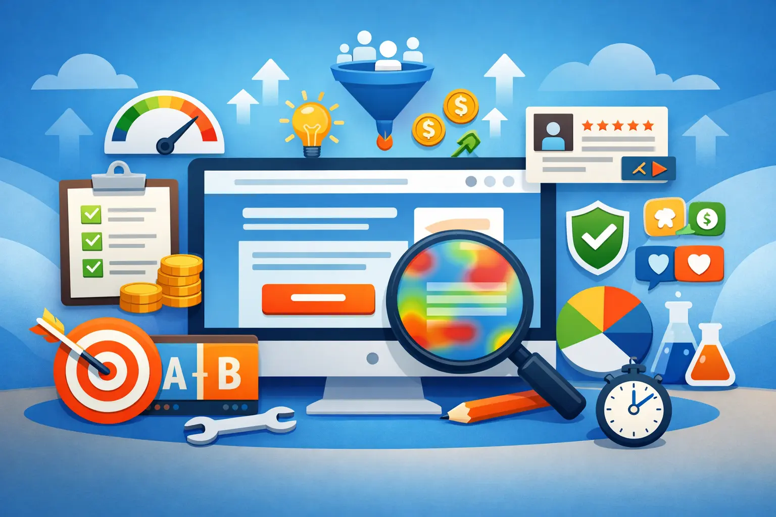
Testing & Optimization: Never Stop Improving
Even well-designed landing pages should be tested. A/B testing headlines, CTAs, form lengths, and visuals gradually improves conversion. Analyze behavior with tools like heatmaps and session recordings to understand how users interact with your UI/UX elements and changes.
Common Mistakes That Kill Conversions
Avoid these pitfalls:
- Clutter and distractions: Too much content pulls users away from your goal.
- Weak or hidden CTAs: If the next action isn’t obvious, users won’t convert.
- Unclear value proposition: If users don’t understand what they’ll get, they’ll bounce.
- Heavy, slow pages: Technical delays reduce conversions before users even see your page.
Conclusion
Building a landing page that converts isn’t about luck — it’s about clarity, focus, and intentional design. By applying proven landing page conversion tips and optimal UI/UX elements, you can guide visitors from curiosity to action. Focus on strong headlines, simple experiences, strategic visuals, trust signals, and continuous optimization to achieve higher conversions. With the right approach, your landing pages can become powerful drivers of growth and revenue.